MENTAL HEALTH AWARENESS WEEK CAMPAIGN
OBJECTIVE
Each year for Mental Health Awareness week/month the Mental Health Foundation puts out a theme for companies to follow, this year’s theme was anxiety.
The brief was to produce a campaign visual to promote both Unmind’s upcoming webinars and content within the app. This would be rolled out across a number of digital assets.
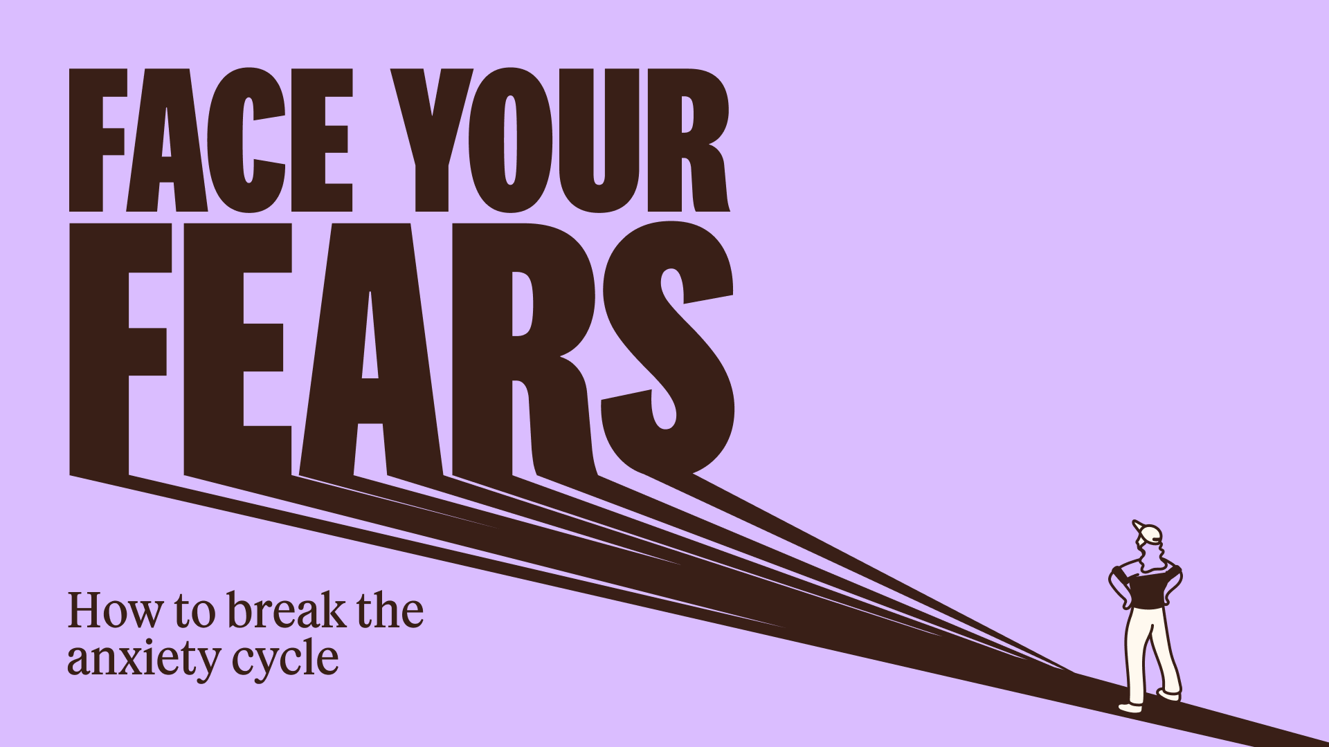
The copy team decided on the header ‘Face your fears’.
VISUAL RESEARCH

As the first campaign in the new brand (including a new, witty, illustration style) research into the style was necessary.
Illustrations by Jeremyville

Illustrations by Em The Creative

Illustrations by Albert Tercero
INITIAL ROUTES
These routes were presented including the captions underneath.

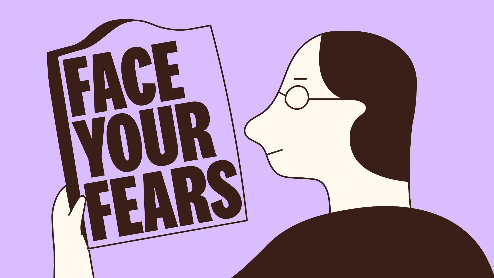
Came to me straight away when I read it. Literally ‘facing your fears’. Could also be a certain type of fear being represented in the mirror, maybe as if you’re looking out to stage, about to give a presentation.

Monster representing the fears, person climbing up to ‘face’ them.
BUT does it look like we’re taking the mick out of people’s genuine fears, making them seem childish? Maybe we could be confronting the monster in another way?

Various fears labelled in tabs, person viewing them/going through/sorting through them. Spiral representing the ‘cycle’.

Standing defiantly against the messaging.

Breaking down your walls. Microphone to represent public speaking. Ties in with the subheading ‘break the cycle’.


Various figures climbing up/sitting on ‘FEARS’ to look like they’re ‘conquering’ them. Would work in any dimension or layout of text.

Self-care messages written on top of ‘FEARS’. Might look like we’re suggesting to bury your fears, or hide behind them, though.

Pushing through a door, entering the ‘fear zone’.
FINAL CAMPAIGN VISUAL (OR WAS IT?*)
*Not yet!
When the main stakeholder came back from holiday he had concerns that the Science team would think we were playing down, or underestimating, people’s genuine fears.
The monster was subsequently culled.

LET’S TRY AGAIN
The main stakeholder liked these two concepts so I decided to do an amalgamation of them.

FINAL FINAL CAMPAIGN VISUAL
Serious with a hint of wit.
Although much smaller than the mirror, the girl stands in a defiant position, hands on her hips, standing up to the ‘unknown’ or her ‘fears’. The shadow emphasises the size of the mirror.
The spiral in the mirror represents the wording in the subheader - ‘cycle’.
The composition of the headline and the illustration was purposeful, fitting together like a jigsaw. It can be used for a number of dimensions, with the illustration able to slightly overlap the copy if needs be.

CREATING THE ASSETS
We had two things we needed to advertise:
1. Pieces of content within the app itself
2. The regional webinars (called ‘Spaces’) that Unmind was facilitating

GENERAL ASSETS
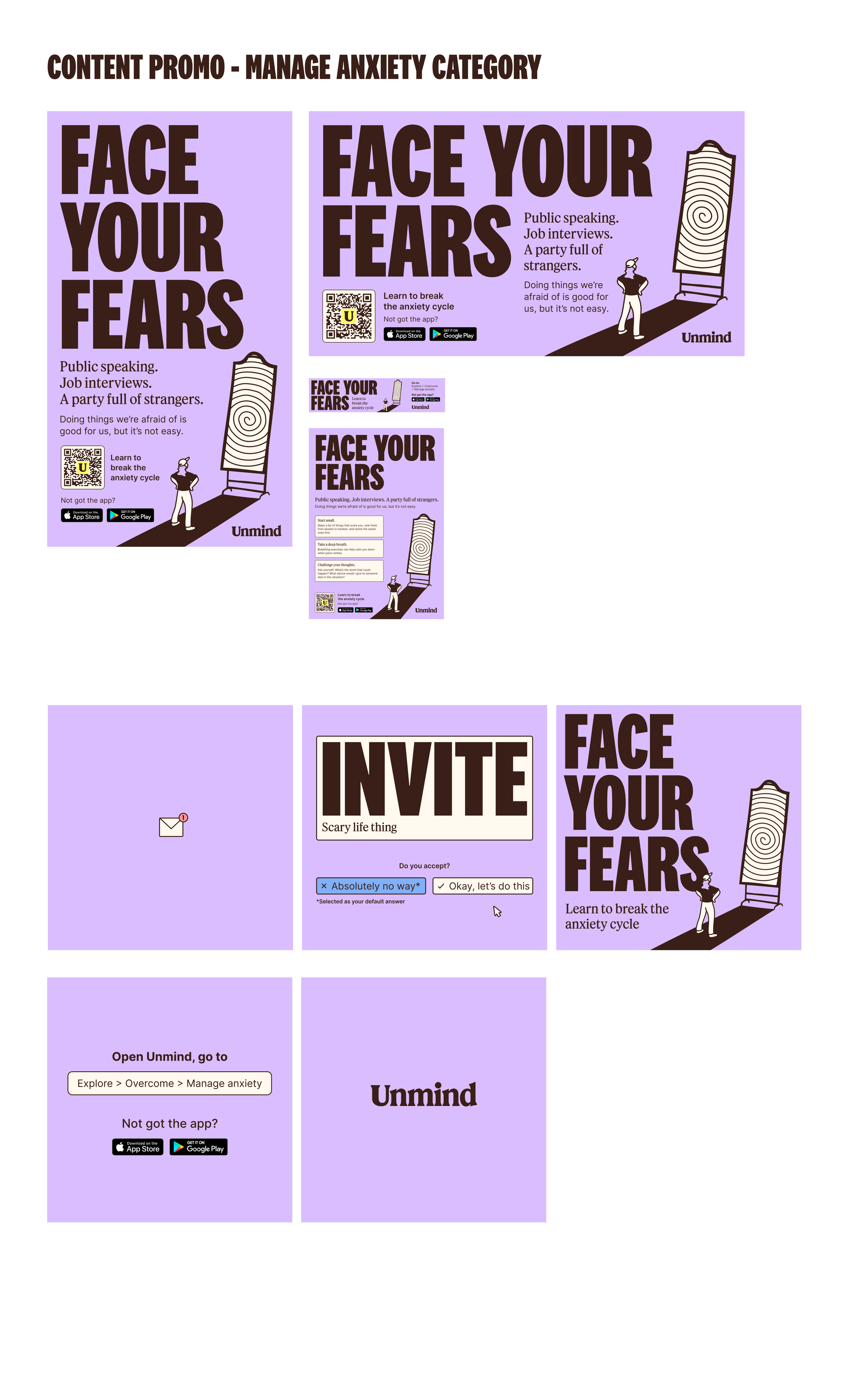
CONTENT PROMOTION

WEBINAR PROMOTION
All assets were uploaded to Paperflite for the clients to download and distribute. This included a ‘copy doc’ to assist the clients with everything they may need to know about the campaign.
VIDEO
For this video I created the concept, copy, design and animation.
