UNMIND MEN’S HEALTH AWARENESS MONTH
OBJECTIVE
During Men's Health Month, our brand team launched "Ask About the Thing", a campaign encouraging men to speak openly about sensitive topics rather than avoiding them. Whether facing loss or other difficult conversations, the goal was to empower individuals to ask direct questions instead of resorting to small talk.
This campaign was shared exclusively with our clients and was not promoted through webinars or social media.
INITIAL SKETCHES
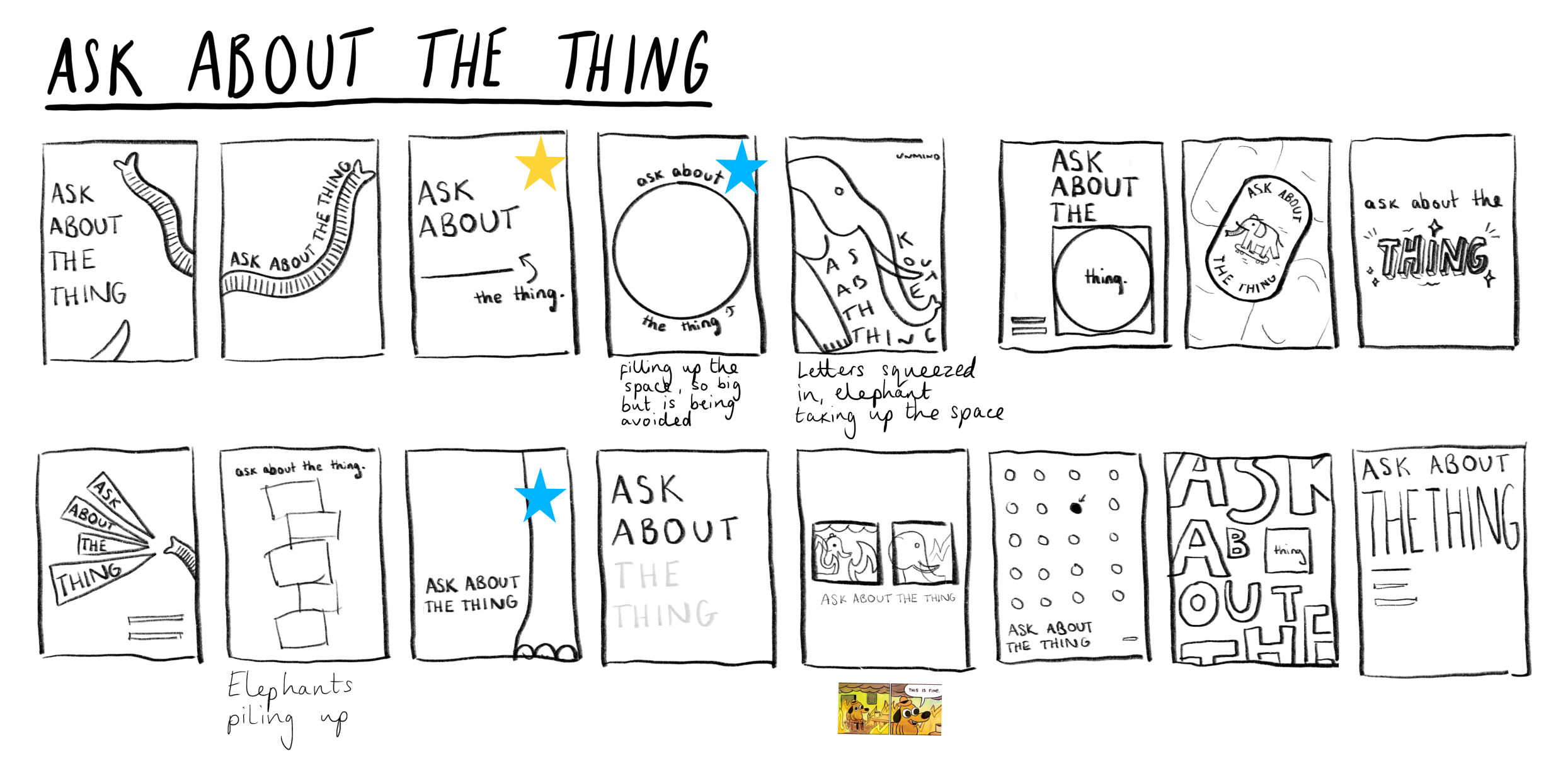
DEVELOPING VISUALS

ROUTE 1 - ELEPHANT IN THE ROOM
This route plays on the well known idiom - the elephant in the room - a topic/conversation known to everyone, that people do not want to speak about for whatever reason.
If you imagine an elephant in a room, it’s going to take up a considerable amount of space. Therefore it only makes sense that it takes up a lot of space on the page too.
I didn’t want to be too obvious with the elephant, more as if it was just lurking in the background

ROUTE 2 - TAKING UP SPACE
In this route I really wanted to emphasise the idea of taking up space. As if it was this big thing that needed to be spoken about.
In the first visual, the ‘thing’ is so big it splits apart the header, making it squeeze into whatever space left. This represents having to squeeze out whatever conversation possible to avoid speaking about the ‘thing’.
In the second visual, I’ve used an asterisk to represent the difficult conversation, again taking up the majority of the space.

ROUTE 3 - SHOUTY HANDRAWN
Copy-led route
Would work as a poster but wouldn’t really work for smaller assets as there would be too much content on screen.
WORKING UP VISUALS


During a meeting to discuss the campaign, we had these visuals on the big screen in the office. We asked a passerby if they understood what it was/meant. They did not - time to make it more obvious.
MORE ELEPHANT-Y*
*But not elephant-y enough

EVEN MORE ELEPHANT-Y

All assets were uploaded to Paperflite for the clients to download and distribute. This included a ‘copy doc’ to assist the clients with everything they may need to know about the campaign.
VIDEO
For this video I created the concept, copy, design and animation. Editing the typing sound to the keyboard was tedious but this gal stuck to her vision.