WHITE STUFF
INTEGRATED DESIGNER TASK
TASK 1
White Stuff launched a series called ‘Life, Stuff, Style’ in early 2022, where we interview different groups of unique individuals bounded together by common interests.
It is a celebration of the people who aren’t afraid to go against the grain and stand out from the crowd.
The content has been featured on our website.
TASK 1
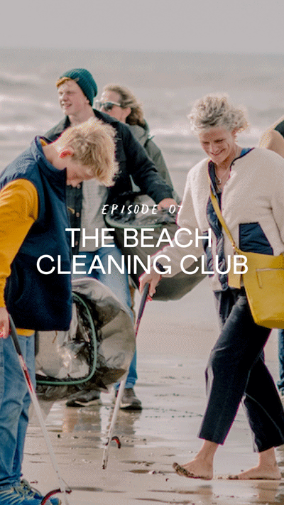
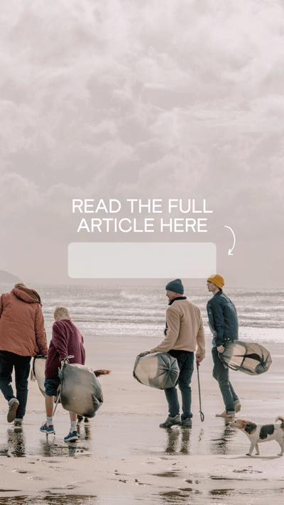
Turn Episode 7 ‘The Beach Cleaning Club’ into a dynamic and engaging social stories post. Please include cover, introduction, examples of editorial layout using images and quotes. Minimum 6 slides in total. You’re also encouraged to use motion and animated elements when suitable. Images are provided (see folder 1) and copy can be found on the website.
BRIEF 1

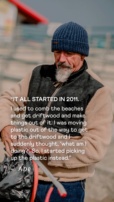


With social stories it’s important to not have the viewer waiting around for the content - because they will not. This is the reason I have chosen not to animate the copy onto the screen. Having the copy on screen from the start will help with viewer engagement.
Using a ‘line boil’ movement on the lines helps add to the hand drawn effect. I have also incorporated the lines on the images themselves, weaving in and out of the portrait to bring a sense of movement and interest.
TASK 1
BRIEF 2
(Re)Design the landing page for ‘Life, Stuff, Style’ that encapsulates the ethos of the series, that gives audience an immediate understanding of what the page is about. Think how to present the brand content in a fun, creative and eloquent way that showcases the brand’s personality, while also taking the user experience into consideration. There are no rules (other than the brand guideline), be free and creative, but please include research, references to back up your concept for the page. Please use images and copy from the website in your mock up.


Looking at the current landing page, there are a few things that jumped out at me that I felt could be changed to improve the user experience:
1 - The lack of breathing space
Most of the page is taken up by images, leaving very little white space. When viewing the page full screen on a desktop it feels just a little overwhelming.
2 - Copy difficult to read
The white copy directly on top of the images makes it sometimes difficult to read.
3 - Most recent episode gets lost
Having the most recent episode only in the header means it may often be missed - sometimes having things too big/obvious in fact makes them less obvious!
With the redesign, my main goal was to create a landing page that felt both airy and playful, with a strong focus on people.
1 - Header and title:
I selected an image from Unsplash that perfectly encapsulates the essence of the series - people coming together and doing what they love. For the header title, I chose Quisas, a playful font that aligns with the series' authentic and lighthearted nature.
2 - New episode banner:
To announce new episodes, I added a subtle cyan banner to the header. However, I made sure to keep the new episode in the grid as well to ensure easy discoverability.
3 - Improved copy hierarchy:
Instead of presenting a dense block of text, I restructured the copy to enhance readability. Now, the text guides the reader's eyes effortlessly, allowing them to absorb the information more easily.
4 - Enhanced layout:
I opted for a three-column layout instead of two, which reduces the size of each image and makes the viewing experience less overwhelming. Each episode title now appears in a Polaroid-like frame, adding a touch of nostalgia and charm.
5 - Consistent hand drawn elements:
To maintain consistency throughout the series, I incorporated hand-drawn elements into the episode titles. Additionally, these elements were used to create a captivating background design, reflecting the series' care-free and fluid nature.
6 - Call to action:
To foster a stronger connection with the audience, I introduced a call to action inviting users to share their own stories. Encouraging interaction with the brand helps build a more profound bond between you and your audience.
By implementing these changes, the redesigned page now feels more breathable, playful, and people-centric, making it more engaging for visitors and aligning better with the series' theme.


TASK 2
Please put together a moodboard using images provided that you think captures the essence of the campaign concept below.
SUMMER IS SOMEWHERE ELSE
Summer is sometime long ago and far away. Misty and half-forgotten. A faded print on a flowing dress. Getting lost in an old story. Floating on a tranquil stream. Soft scents and sweet memories. Exploring a curious garden. Little adventures. Stopping to smell the flowers. Making daisy chains. Or not making daisy chains. Sleepy, sultry, still. Summer’s waiting.
BRIEF

Nostalgic, Dreamy, Tranquil, Adventure, Memories, Whimsical.